The Art of Studio Editing
The Art of Studio Editing
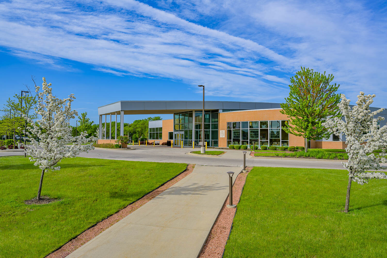
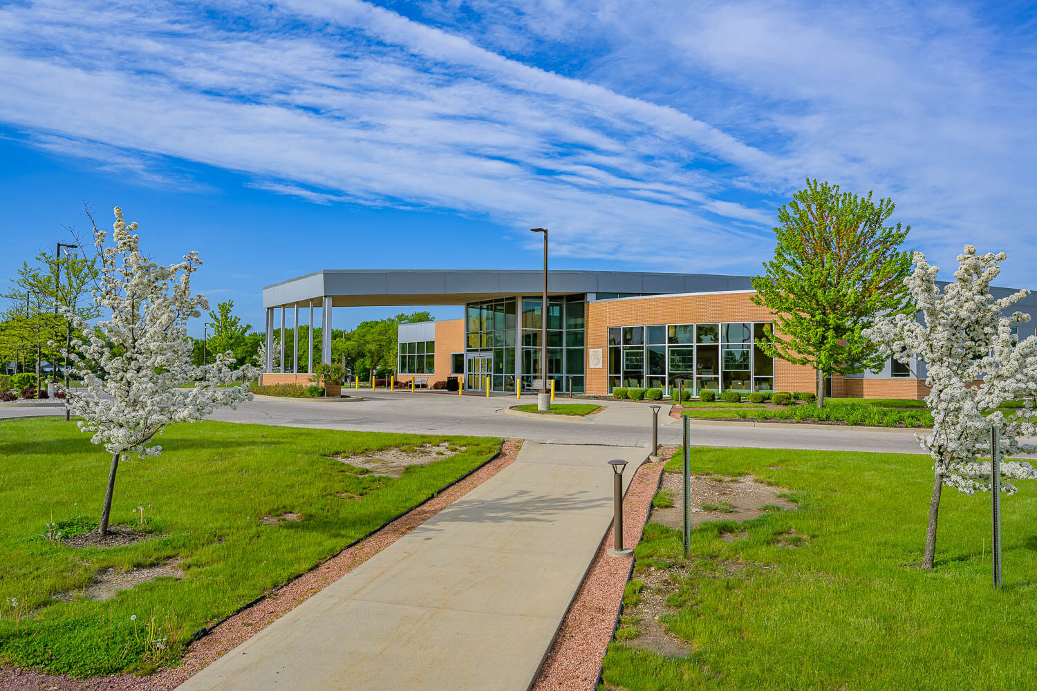
I remember as a kid doing the activity where you look for differences between two pictures. They’re the same image, but in one someone is wearing a polka-dot shirt and in the other they’re wearing stripes. Well, that’s kind of what I did for this post. Here are side by side images showing pre and post editing.
Ascension Medical Group Milwaukee Locations Photo Shoot
For this particular project I did for Ascension Medical Group , I photographed 32 of their Milwaukee locations. It was a mix of facilities including clinics and hospitals. It was a deadline driven project that included removing all distractions and unsightly elements from the delivered images. I had 5 weeks from the start date to have the project done in full.
I wanted to showcase this particular project for two reasons: the first, to show that editing is an art form; and the second, while I don’t mean to brag, is that completing a project of this scope on a tight timetable while exceeding client expectations, well, I’m proud of that.
Seeing Past The End of Your Nose
One last note before I allow you to scroll away through the images. I often write about and share architectural images because of the work I do in architectural photography. However, I believe this is the first time I’m sharing pre and post editing images. As a commercial and industrial photographer the biggest day in and day out challenge I face is seeing beyond what I’m seeing, if that makes sense. I need to know where I can go with the image in front of me when I get to it at my editing desk. In Architecture sometimes the best angle for the building means including distracting elements. I hope you’ll notice that while there is quite a bit of editing of those distractions, there are things to each photo that are constants: ratios, lighting, angles, etc. All those important factors that make a good photograph are there before editing and are enhanced with editing.
With that said, get out your red pen and find the differences.
Here is a building that wouldn’t be considered an architectural wonder, but it is needed by the client to assist their customers to finding the right entrance in the shared building. Cleaning up the distractions from the photo help keep the message clear; This is the door your enter to find us.
Next is a more extreme example. This shared building between Ascension and Children’s Hospital has a good looking backside that shows to a main road behind it. While the front entrance is on more of a private road. Unfortunately the back has some utilities, bad grass and distracting signage. Cleaning all this up lets the viewer focus on what is important, the building.
Here is a building with a great leading line of the pathway, but it is surrounded with patchy grass. Filling in those patches allows the eye to go straight to the building.
Our Wisconsin winters can be real tough on our roads and parking lots. This can make clean architecture photos challenging. Here’s an example where I photographed the building with it’s ideal angle knowing I’d be fixing the parking lot later.
Sometimes I photograph building when I can’t control what’s going on outside. Here is a clinic I photographed that shares a building with the YMCA. There was a constant flow of people, either patients for the clinic or members of the Y. I found the angles I wanted to show and patiently waited for the scene to clear up. There is always a balance in these situations, I feel like I’m at the roulette table… is this moment the best I’m going to get? How much time will this take me to edit and clean up vs how much longer will I have to wait, to maybe not get a more clean version in camera? So instead of telling the gentleman to get off my table and that he’s ruining my shot I just removed him when I was back at my office.
Since everybody loves GIFs, here are a few more.
Are you looking to update your company's image? Do you have multiple locations and need branded marketing materials? Let’s work together to achieve your goals. Click here to contact me.


